![[Stable]](figures/lifecycle-stable.svg)
Produces a graphic representation of AEs by CTCAE SOC.
Usage
butterfly_plot(
  data_ae,
  ...,
  data_pat,
  severe = NULL,
  sort_by = c("total", "severe"),
  range_min = NULL,
  arm = "ARM",
  subjid = "SUBJID",
  group = "AESOC"
)

ae_plot_soc(data_ae, ..., data_pat, severe, sort_by, range_min, arm, subjid, group)
Arguments
- data_ae
adverse event dataset, one row per AE, containing
subjid,grade,group1, and potentiallygroup2.- ...
unused
- data_pat
enrollment dataset, one row per patient, containing
subjid(andarmif needed). All patients should be in this dataset.- severe
name of the logical column in
data_aetelling whether an AE is severe. Case-insensitive.- sort_by
either "total" or "severe"
- range_min
The minimum value for the upper limit of the x-axis range. Set to
1to always include 100%.- arm
name of the treatment column in
data_pat. Case-insensitive. Can be set toNULL.- subjid
name of the patient ID in both
data_aeanddata_pat. Case-insensitive.- group
name of the grouping column in
data_ae. Case-insensitive. Usually, the SOC. This is the variable that will be plotted on the y-axis.
See also
ae_table_grade(), ae_table_soc(), ae_plot_grade(), ae_plot_grade_sum(), butterfly_plot()
Examples
tm = grstat_example(N=100)
attach(tm, warn.conflicts=FALSE)
ae2 = ae %>%
dplyr::mutate(serious = sae=="Yes")
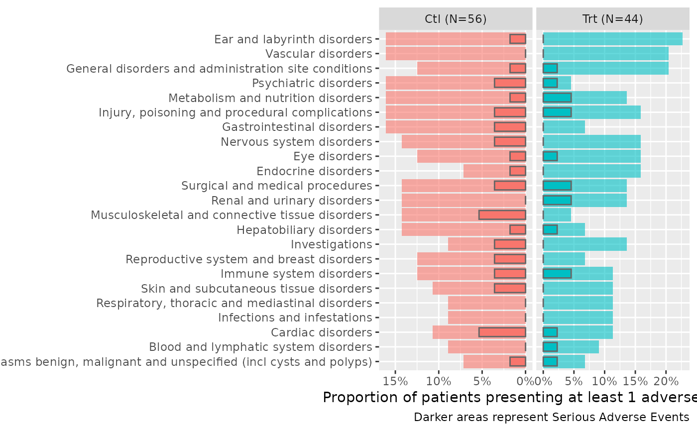
butterfly_plot(ae2, data_pat=enrolres, range_min=0.5)
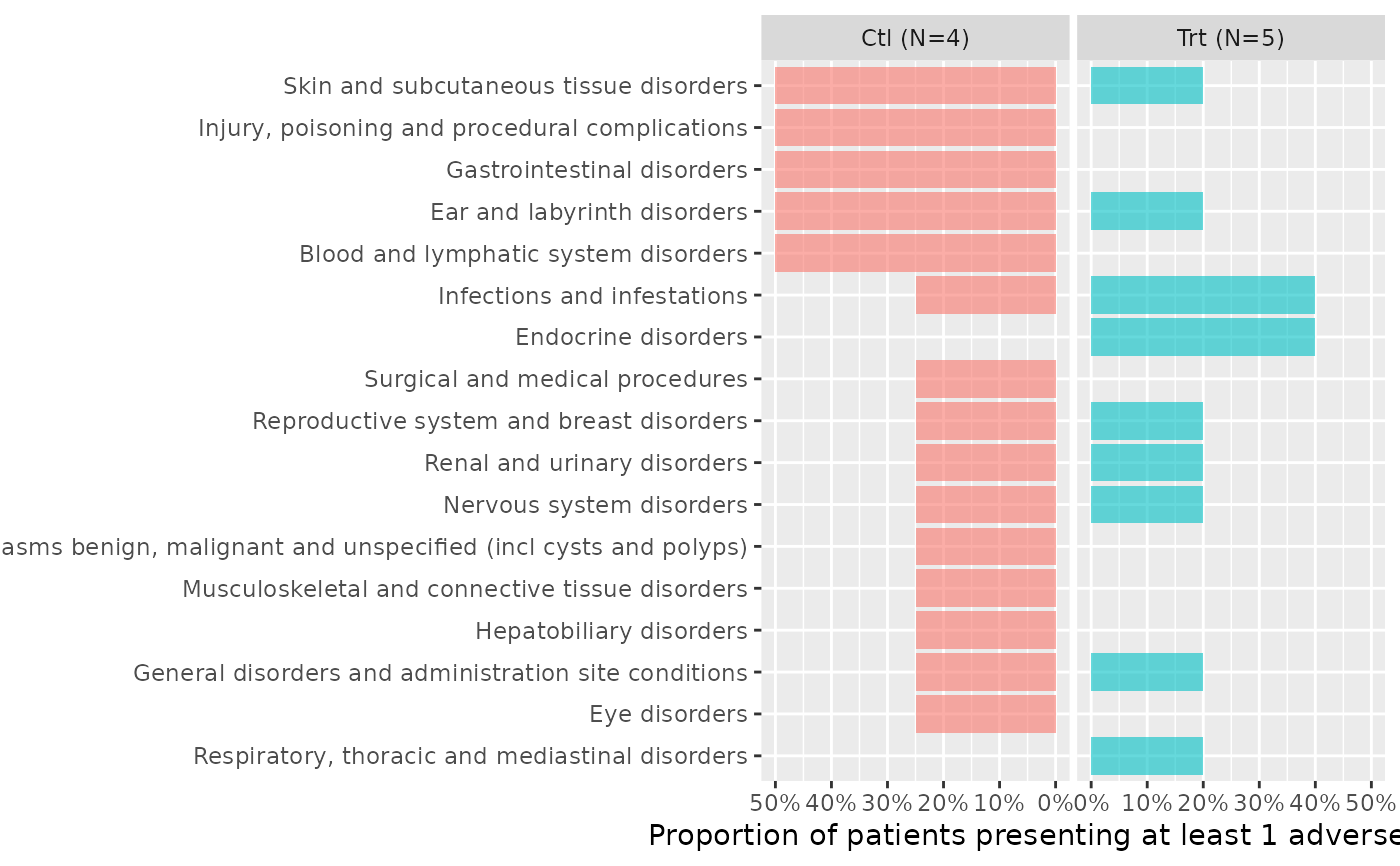
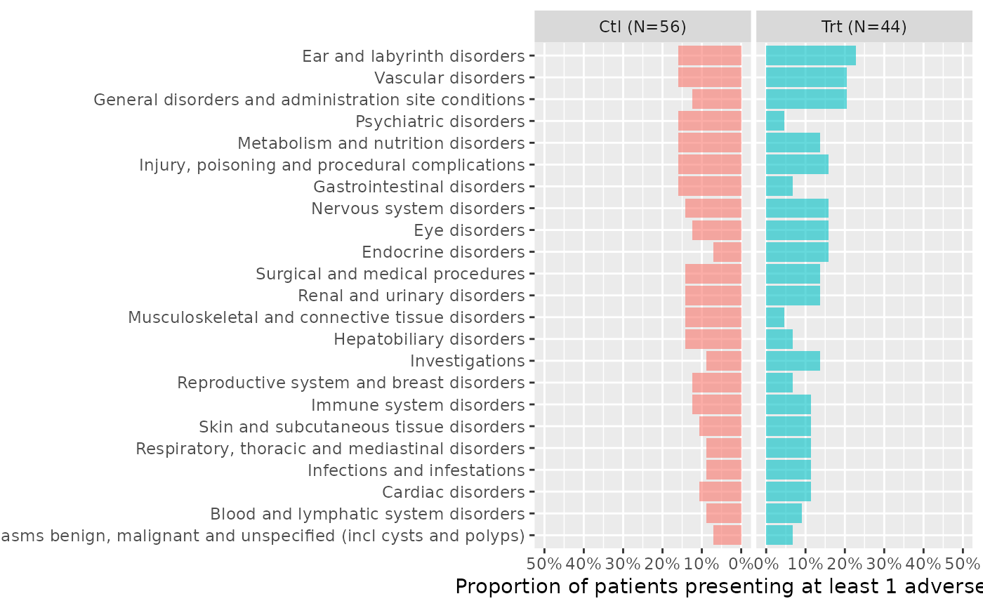 butterfly_plot(ae2, data_pat=head(enrolres,9), range_min=0.5)
 ae2 %>%
butterfly_plot(data_pat=enrolres, severe="serious") +
ggplot2::labs(caption="Darker areas represent Serious Adverse Events")
ae2 %>%
butterfly_plot(data_pat=enrolres, severe="serious") +
ggplot2::labs(caption="Darker areas represent Serious Adverse Events")