![[Experimental]](figures/lifecycle-experimental.svg)
Creates a waterfall plot showing the best percent change from baseline in
target lesion size for each subject.
Arguments
- data
A data frame with one row per subject, typically produced by
calc_best_response().- ...
Not used. Ensures that only named arguments are passed.
- y
Name of the numeric column used for the bar height. Defaults to
"target_sum_diff_first".- fill
Name of the categorical column used for bar fill color. Defaults to
"best_response".- shape
Optional name of a categorical column used to add a symbol above or below each bar.
- arm
Optional name of a column used to facet the plot by treatment arm.
- subjid
Name of the subject identifier column. Defaults to
"SUBJID".- resp_colors
Named vector of colors used for RECIST response categories.
- warnings
Logical. If
TRUE, warnings are emitted when missing values are detected in plotted variables.
Details
The input data must contain one row per subject, use calc_best_response()
to convert from long-format RECIST data.
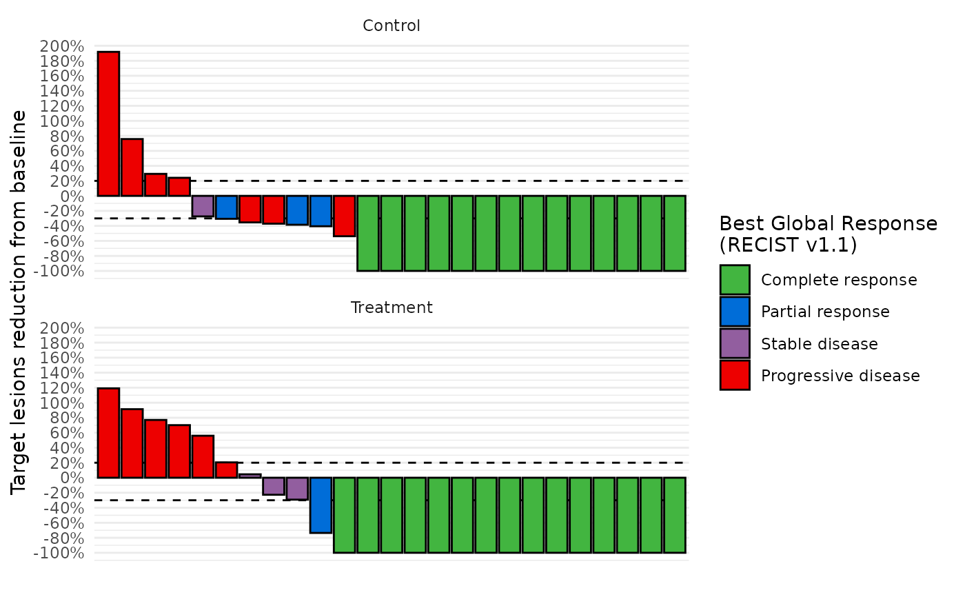
Bars are drawn for individual subjects, optionally faceted by treatment arm. Horizontal dashed reference lines are added at -30\ to common RECIST response thresholds.
Examples
db = grstat_example(N=50)
data_best_resp = calc_best_response(db$recist)
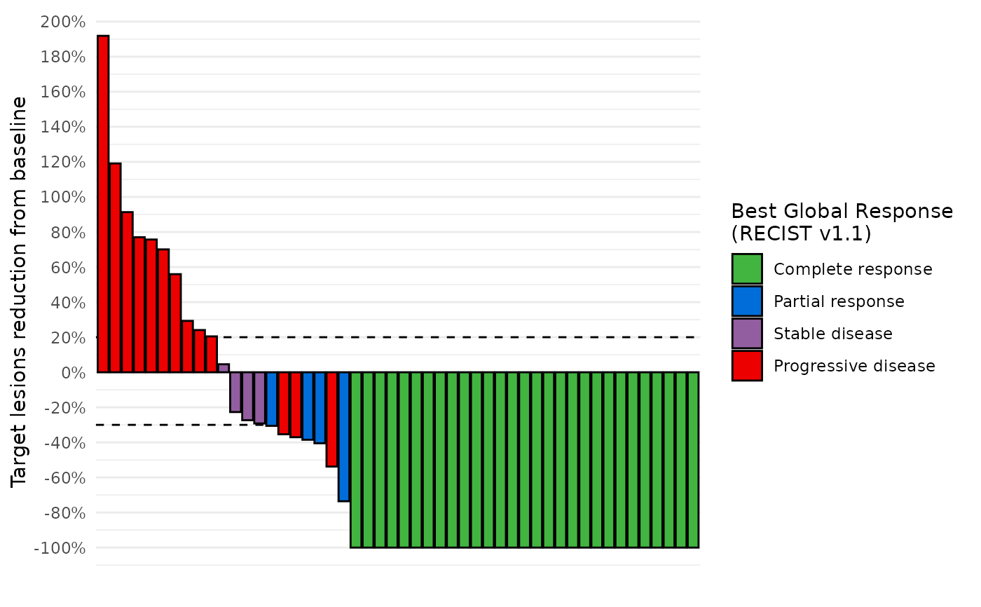
# Basic waterfall plot
waterfall_plot(data_best_resp)
 # Facet by arm
data_best_resp %>%
dplyr::left_join(db$enrolres, by="subjid") %>%
waterfall_plot(arm="ARM")
# Facet by arm
data_best_resp %>%
dplyr::left_join(db$enrolres, by="subjid") %>%
waterfall_plot(arm="ARM")
 # Add symbols
set.seed(0)
data_symbols = db$recist %>%
dplyr::summarise(
new_lesion=ifelse(any(rcnew=="Yes", na.rm=TRUE), "New lesion", NA),
example_event=cut(runif(1), breaks=c(0,0.05,0.1,1), labels=c("A", "B", NA)),
.by=subjid
)
data_best_resp %>%
dplyr::left_join(data_symbols, by="subjid") %>%
waterfall_plot(shape="new_lesion")
# Add symbols
set.seed(0)
data_symbols = db$recist %>%
dplyr::summarise(
new_lesion=ifelse(any(rcnew=="Yes", na.rm=TRUE), "New lesion", NA),
example_event=cut(runif(1), breaks=c(0,0.05,0.1,1), labels=c("A", "B", NA)),
.by=subjid
)
data_best_resp %>%
dplyr::left_join(data_symbols, by="subjid") %>%
waterfall_plot(shape="new_lesion")
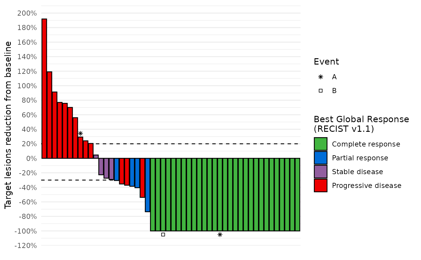
 data_best_resp %>%
dplyr::left_join(data_symbols, by="subjid") %>%
waterfall_plot(shape="example_event") +
ggplot2::labs(shape="Event")
data_best_resp %>%
dplyr::left_join(data_symbols, by="subjid") %>%
waterfall_plot(shape="example_event") +
ggplot2::labs(shape="Event")